In a move that signals a significant evolution in its visual identity, Google has announced a comprehensive redesign of its iconic Gmail icon, along with other key icons within its Workspace suite. This revamp introduces a fresh gradient aesthetic, moving away from the more minimalist and monochromatic designs that have characterized Google's products for years. The new design aims to bring a more unified and vibrant look across Google's diverse range of applications, fostering a cohesive user experience.
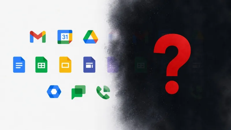
The most noticeable change is to the familiar Gmail envelope icon. Previously a more straightforward representation, the updated icon now features a dynamic interplay of colors, utilizing a gradient that blends the traditional red, yellow, green, and blue of the Google logo. This gradient is not merely a superficial alteration; it's part of a broader design philosophy that Google is implementing across its entire Workspace ecosystem, which includes applications like Google Drive, Docs, Sheets, Slides, and Calendar. The goal is to create a more visually engaging and modern interface that reflects the interconnected nature of these productivity tools.
This redesign is more than just an aesthetic update; it's a strategic decision by Google to align its visual language with its ongoing efforts to integrate its various services more seamlessly. The gradient motif is intended to convey a sense of dynamism, innovation, and fluidity, mirroring the way users interact with and move between different Workspace applications. The company believes that a consistent and appealing visual presentation will enhance user engagement and reinforce the perceived value of its productivity suite.
While the core functionality of Gmail remains unchanged, the visual refresh is expected to be well-received by users who appreciate modern design trends. The new gradient icons are gradually rolling out to users across various platforms, including web, Android, and iOS. This initiative underscores Google's commitment to continuous improvement and its willingness to adapt its brand identity to stay relevant in an ever-evolving digital landscape. The shift towards more colorful and gradient-based designs is a clear indicator of Google's desire to present a more human-centered and visually appealing digital environment for its billions of users worldwide. It’s a subtle yet impactful change that signifies a new chapter in Google's design journey, aiming to make its digital tools not only functional but also aesthetically pleasing and memorable.
Google Revamps Gmail Icon With New Gradient Design
Admin
1 Views
2 min read
Source:
TechJuice